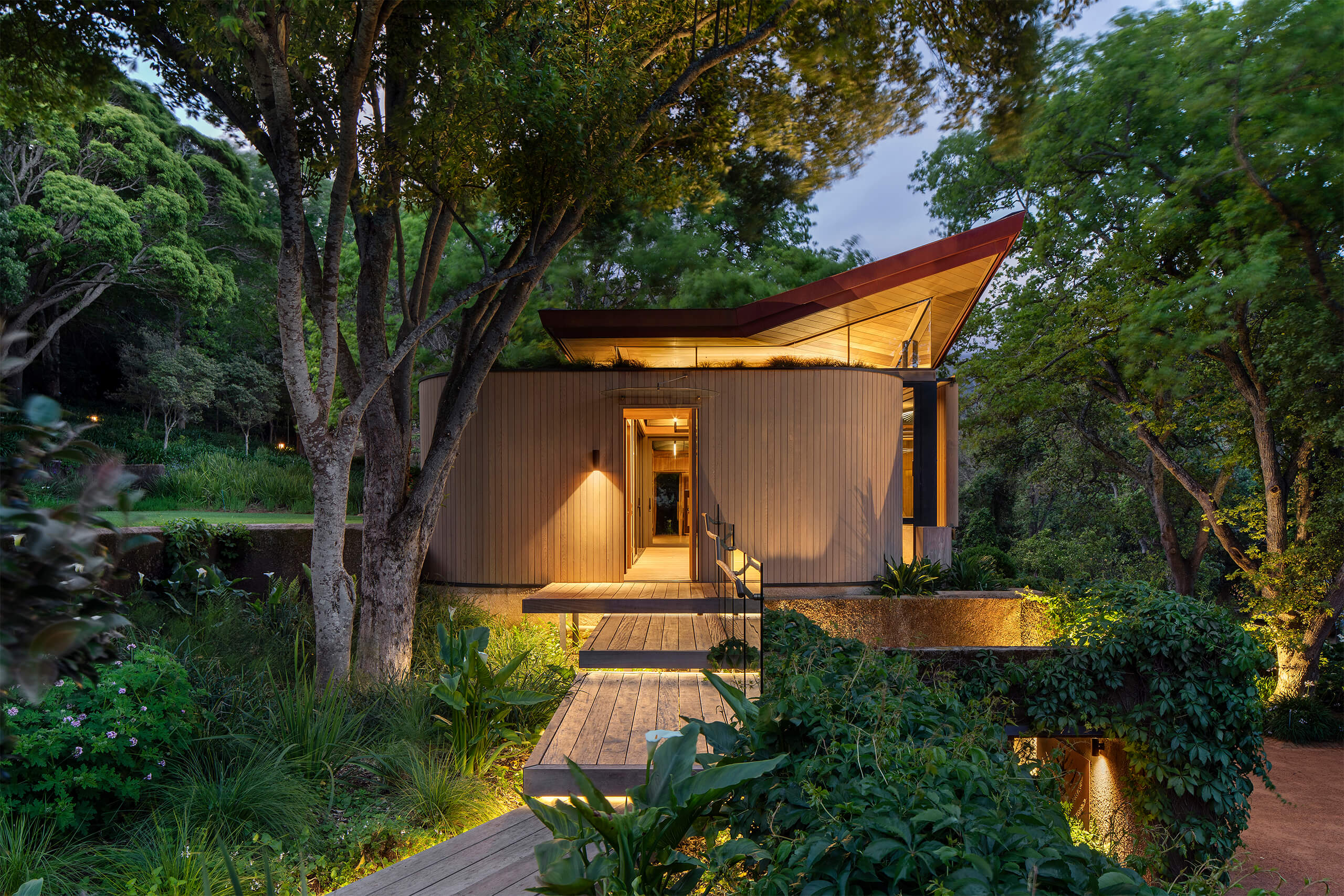
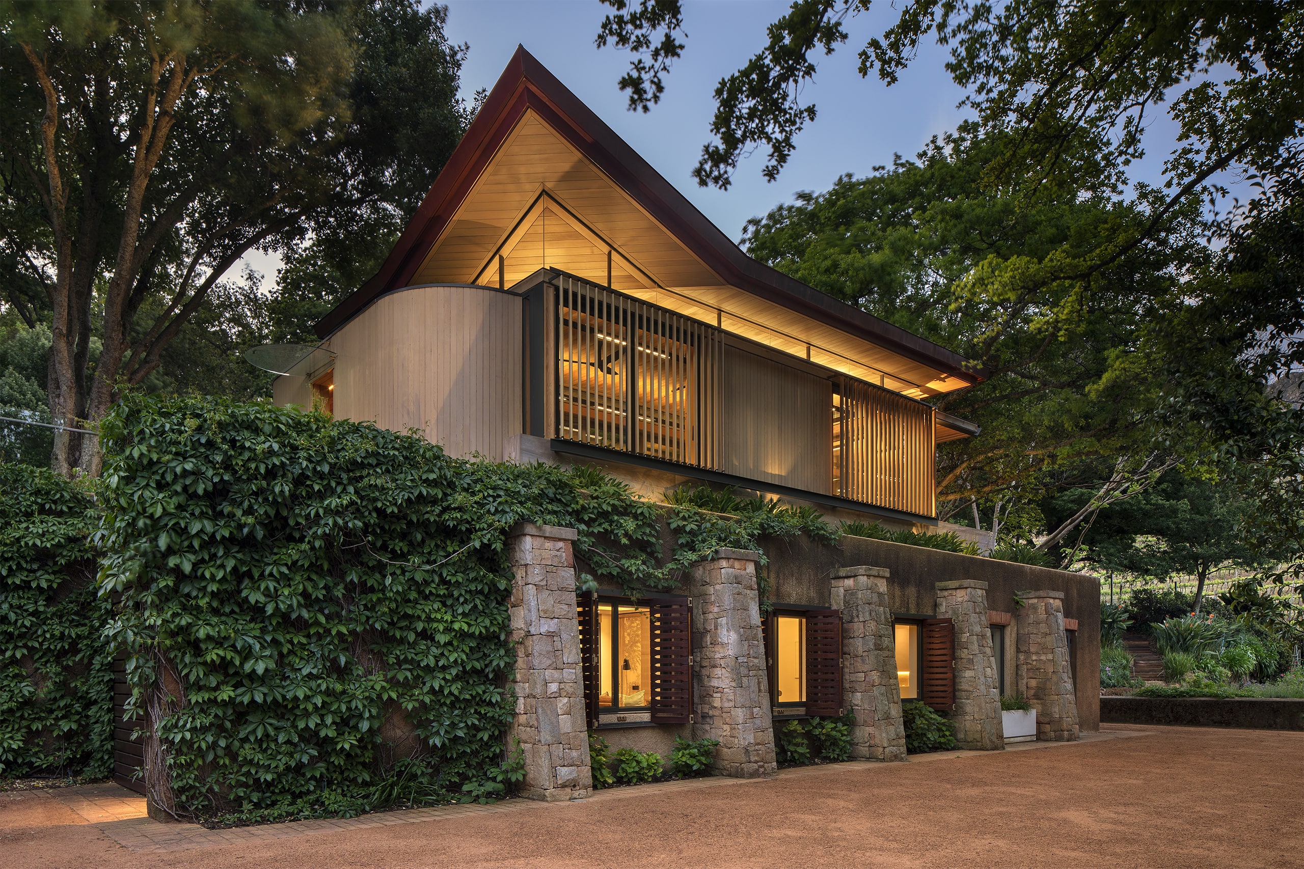
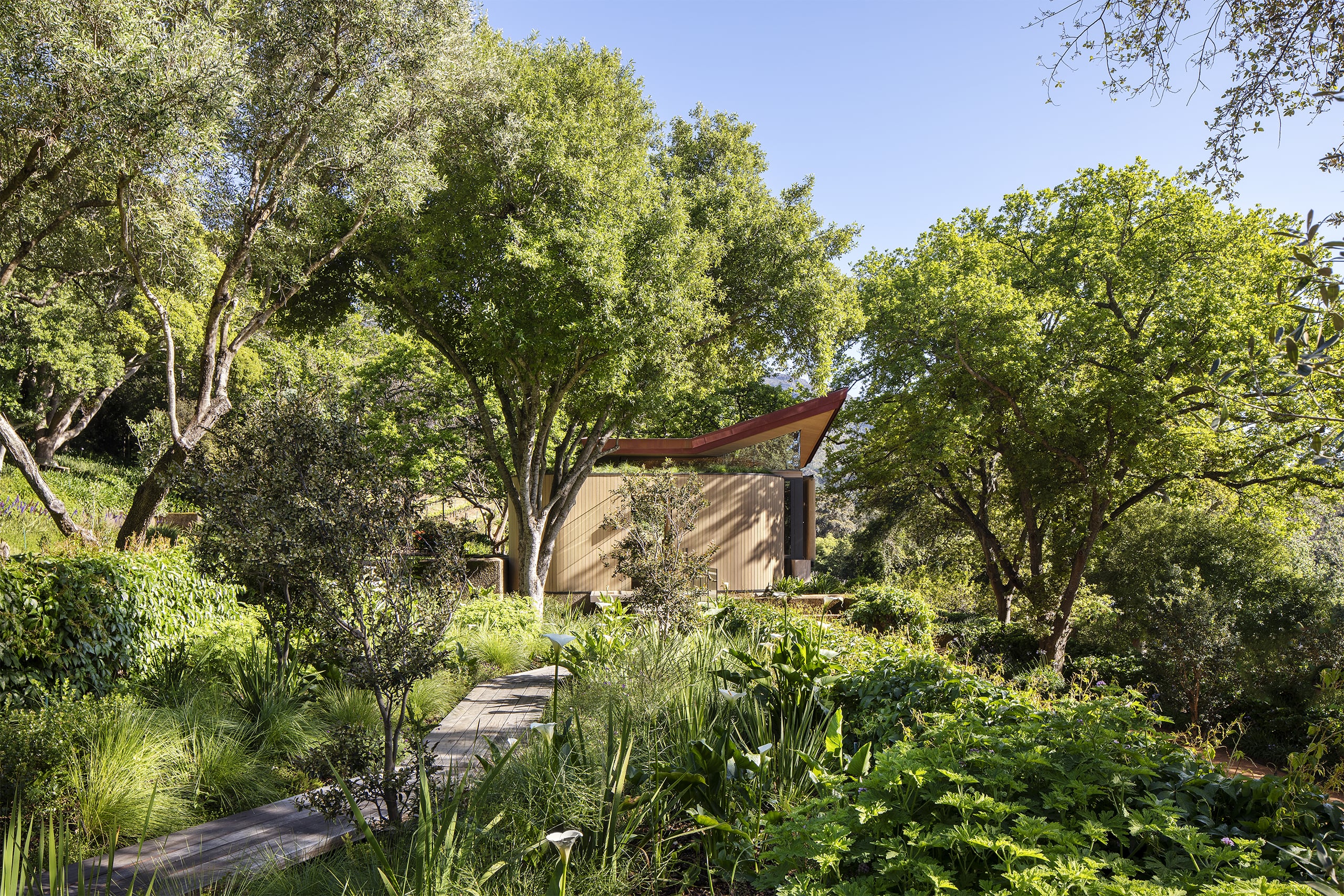
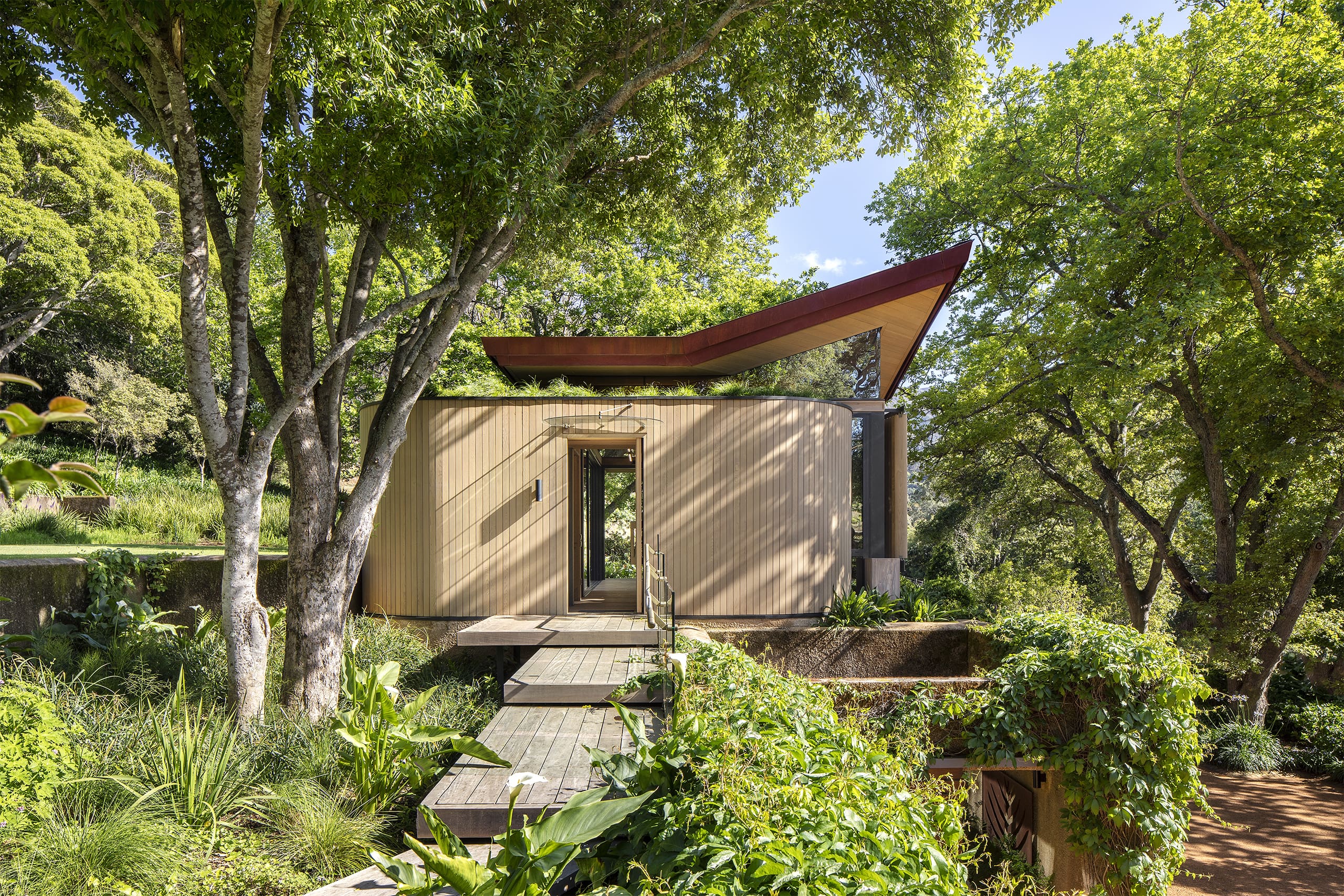
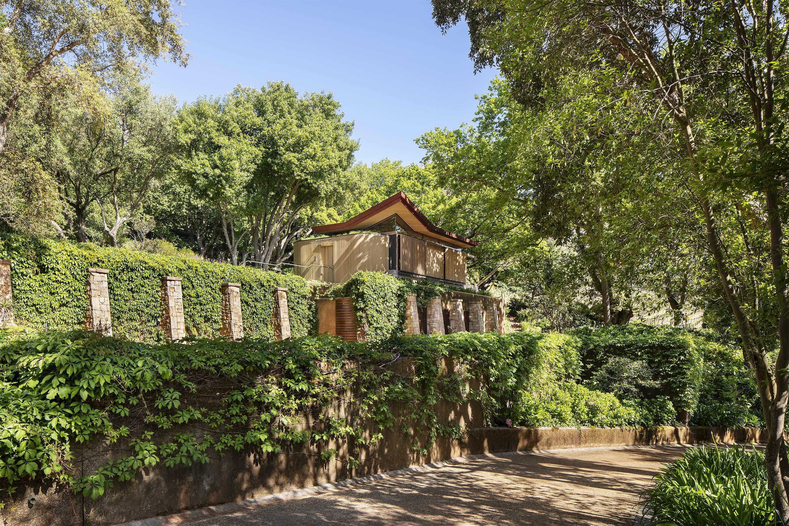
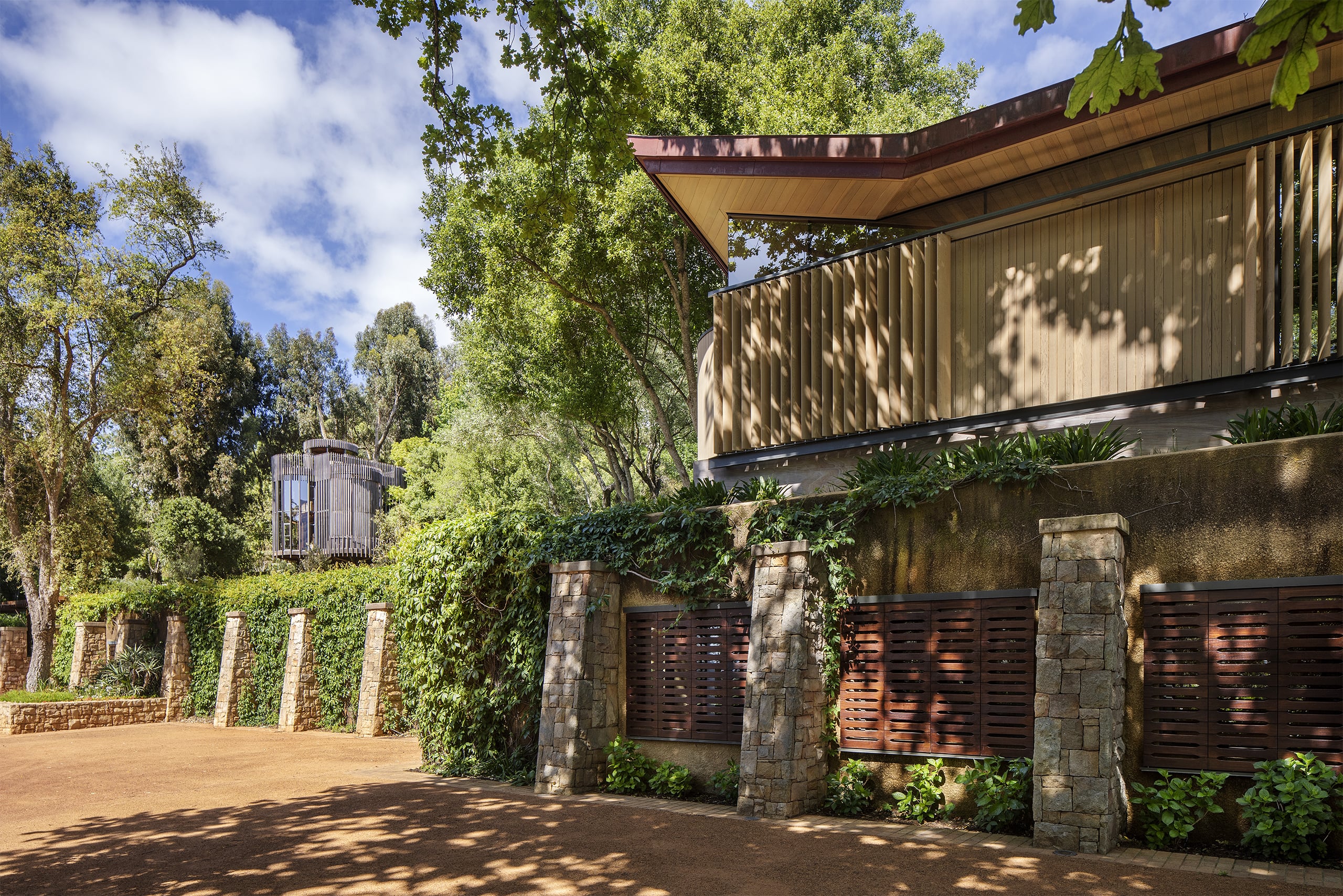
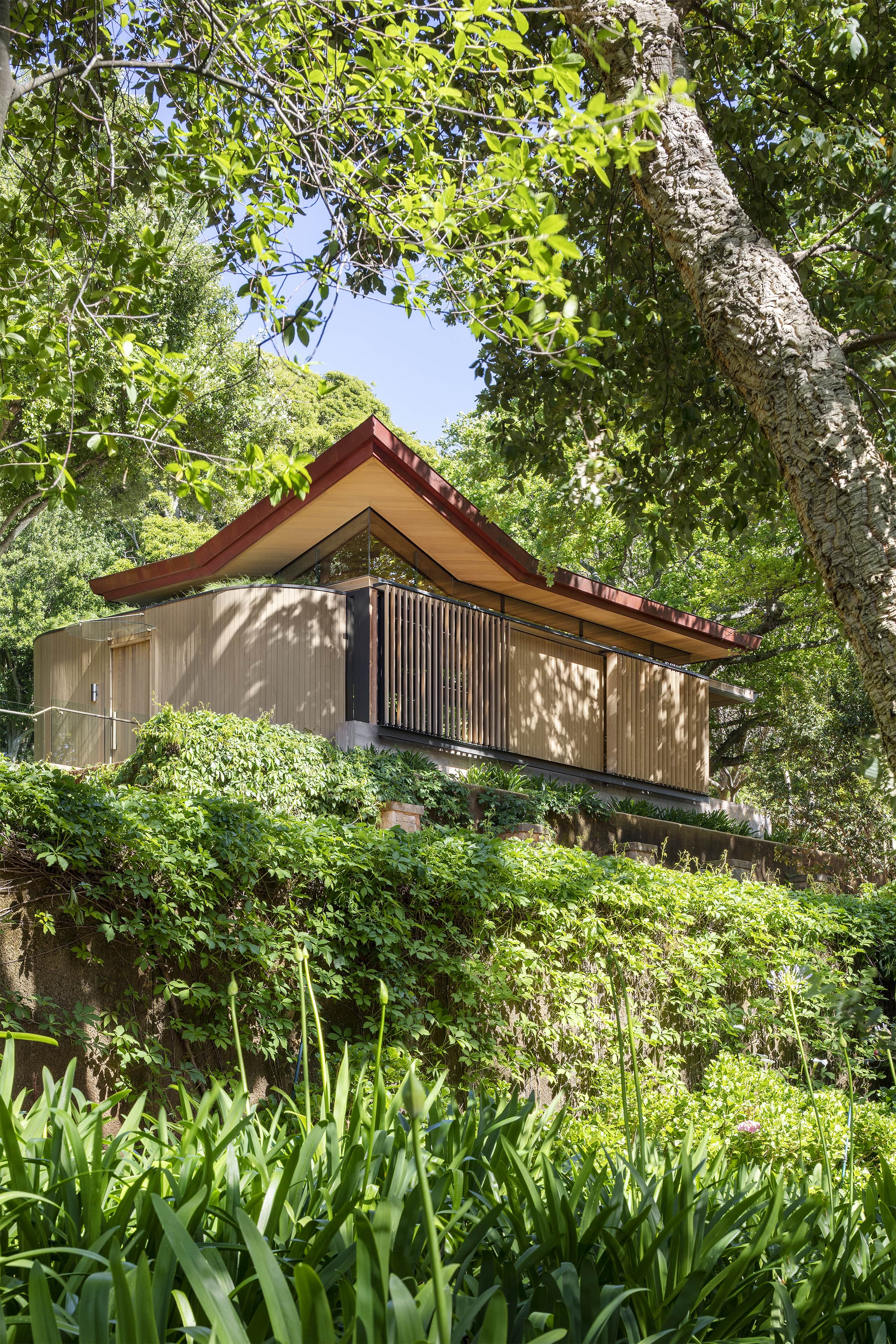
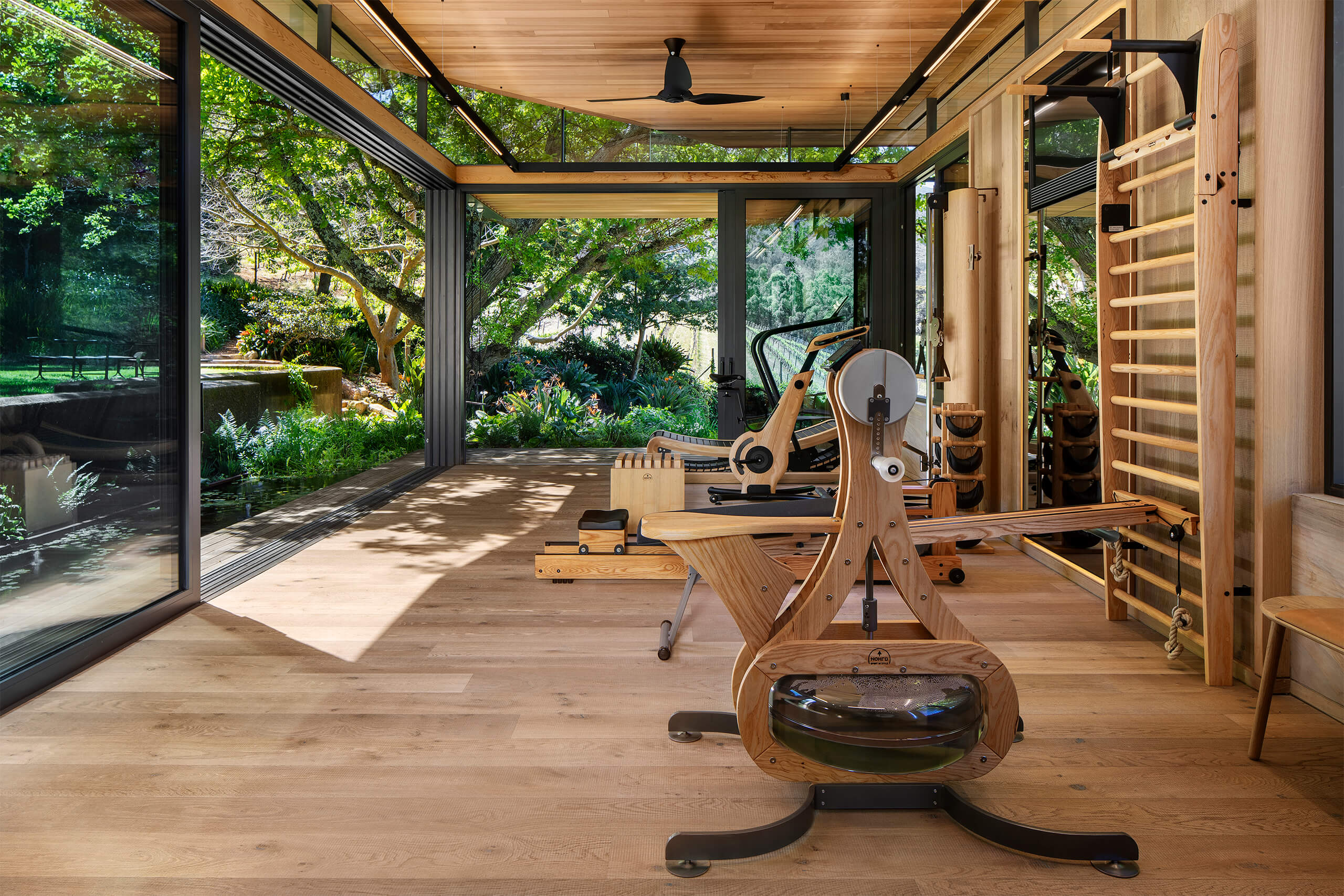
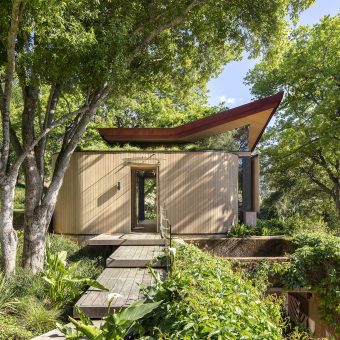
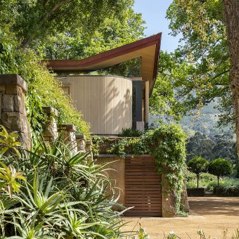
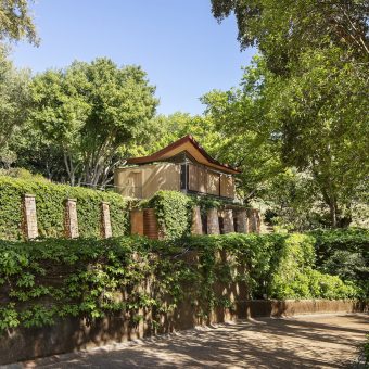
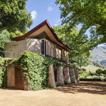
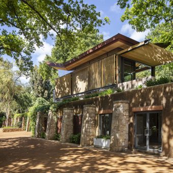
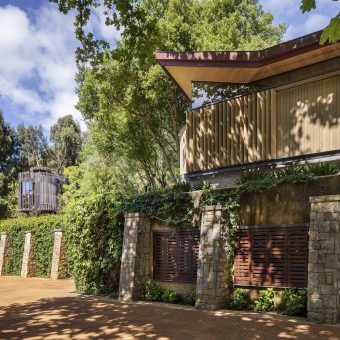
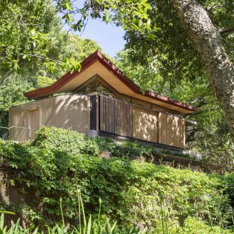
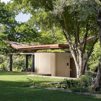
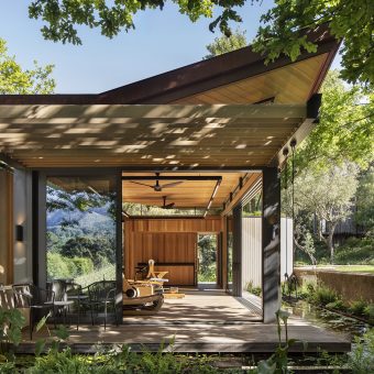
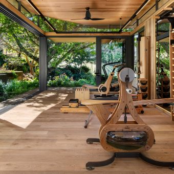
The project brief called for the addition of a gymnasium pavilion to the existing context of a large family estate in Constantia. The architects have been involved in the master planning and various buildings on the estate, and the aim was to reduce the impact of a new structure on the well-established gardens, informing the decision to construct the gym pavilion onto the existing concrete slab roof of an older guest cottage and storage area.
The chosen position within the estate presented exciting prospects: surrounding mature trees offered shelter and sitting perched on the edge of an existing retaining wall provided a sense of dynamic balance. The site, being between the main upper lawn of the garden and the parking werf below it, would allow the building to engage with a wide range of different view aspects as well as connect to the difference terraced levels surrounding it. The position also meant the gymnasium could be linked to the guest suite below it by means of an internal staircase. The guest suite received an update with new open-plan layout, finishes and furnishings.
Steel and timber construction methods were employed to minimize the impact of concrete and other wet works, as most of the components could be manufactured off site, reducing the environmental impact of the construction process.
The architects have been involved in the design and construction of a tree house-like structure for the same client, which is on higher ground not far from the newer gymnasium pavilion. The tree house has served as the inspiration for the selection of materials, construction methodology and detailing.
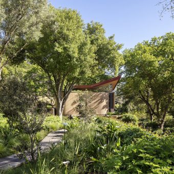
The gymnasium pavilion, similarly, is an exercise in treading lightly on the landscape and aims to make the connection with nature a key design informant – especially as one is acutely aware of the owner’s passion for nature and gardening. It was seen as paramount to design the structure as being recessive to the landscape.
This intention, however, created a paradox, since the very nature of the pavilion typology is one of object rather than the intangible. A lesson learnt from the older tree house project was that the materiality of a building can reduce the impact of an architectural object in the landscape: the natural textures and colours of wood and rusted steel, for instance, can mitigate the starkness of glass; dematerializing building mass can be accomplished by means of slatted screens and pergolas; but most importantly, the result of time’s passing should be embraced, so that natural weathering and oxidation can tone down the marks of man’s hand and tools on wood, copper and steel.
The tectonic stance of the building, that is, to make the architectural concept and logic easily accessible to the viewer or inhabitant, is seen as a dialogue between the response to the landscape, the technical construction aspects thereof and the detailing of every material aspect of the building:
- The gymnasium space is housed under a pavilion-like and hovering roof. The roof is
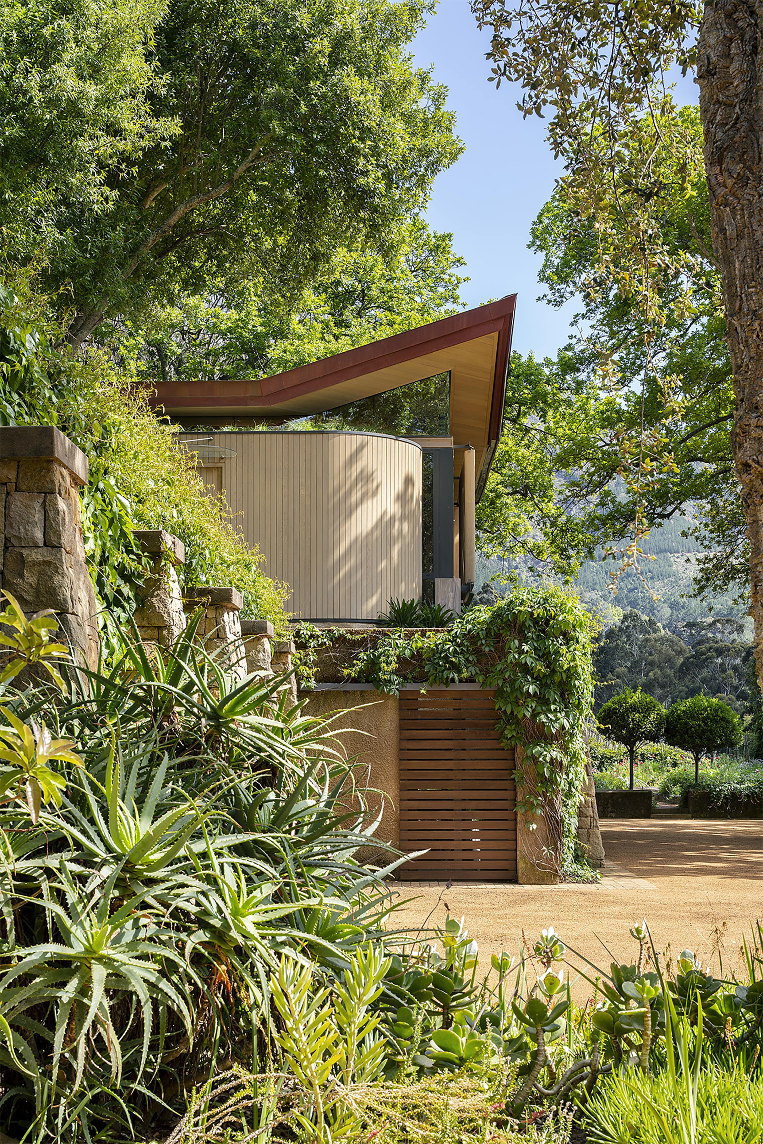
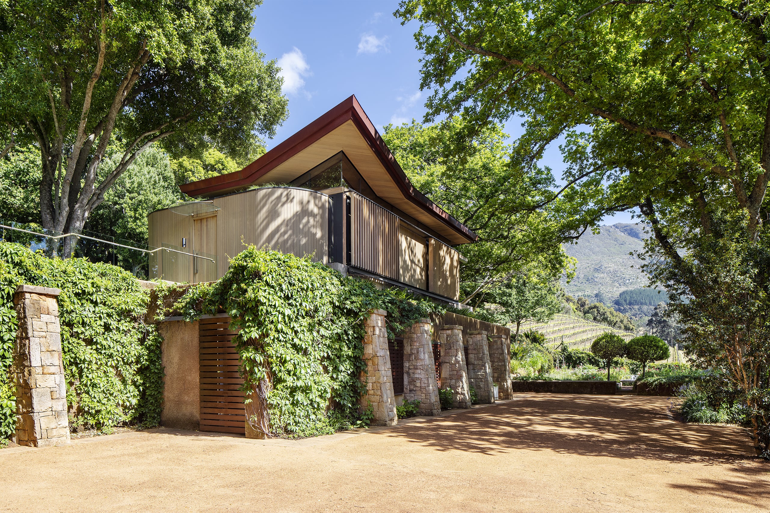
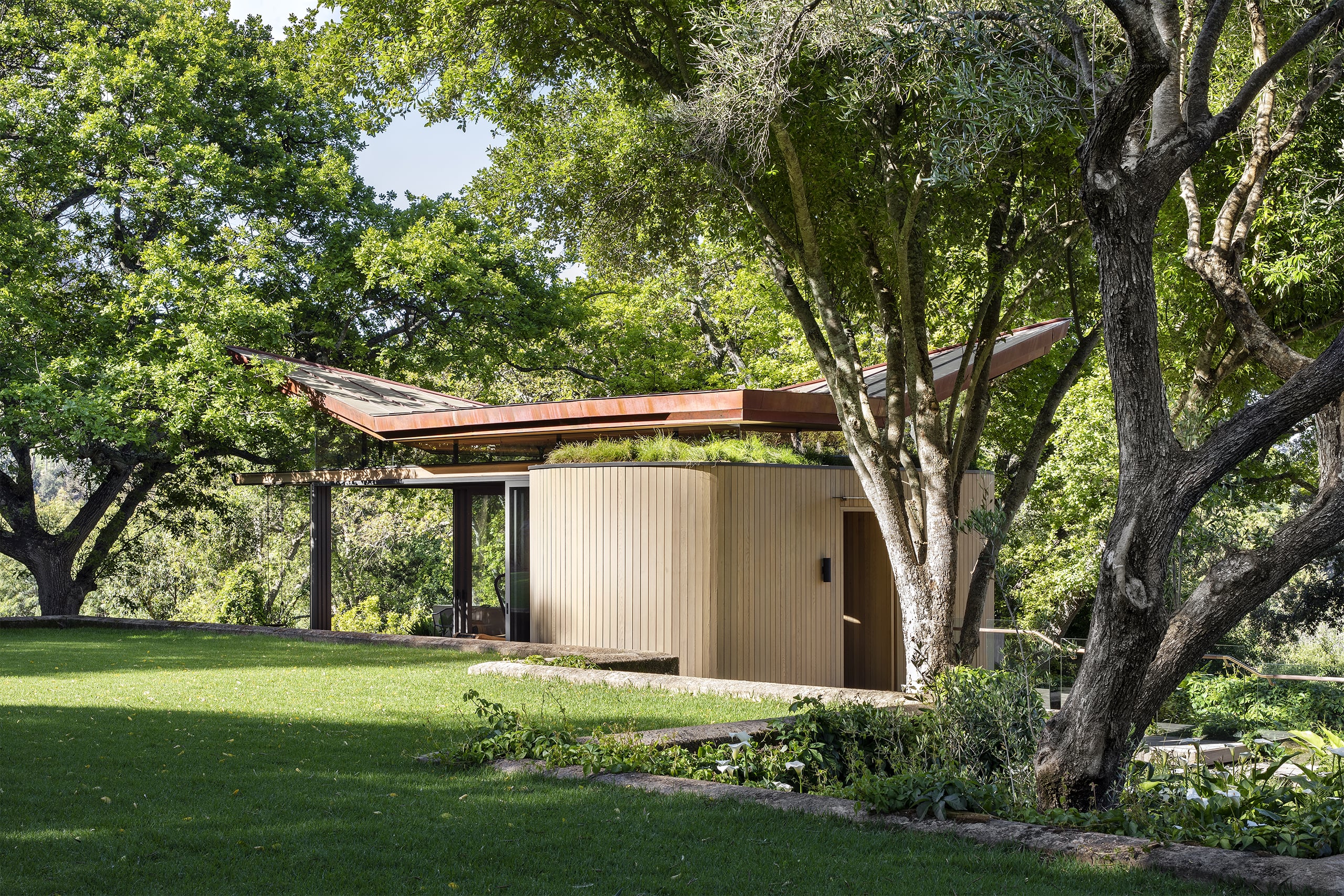
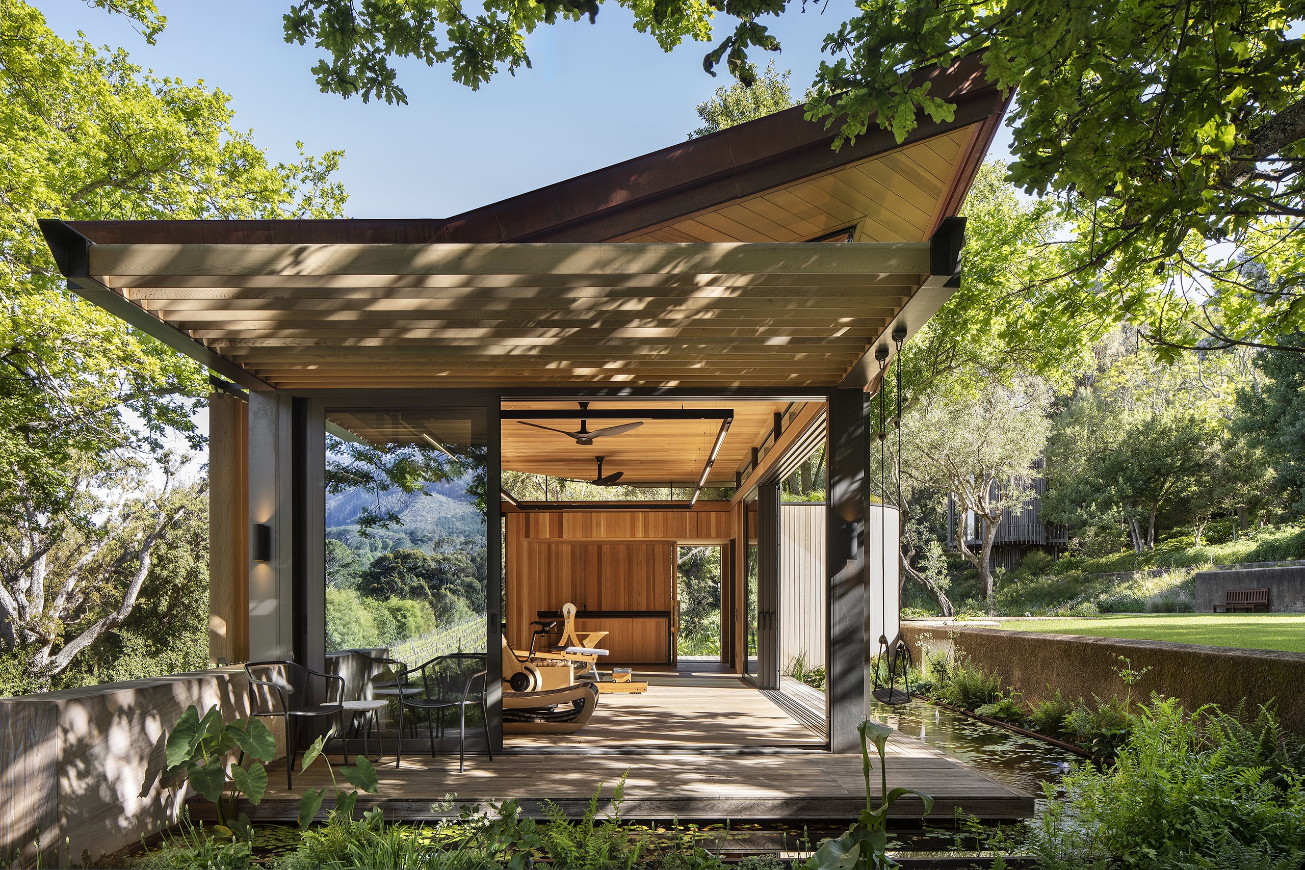
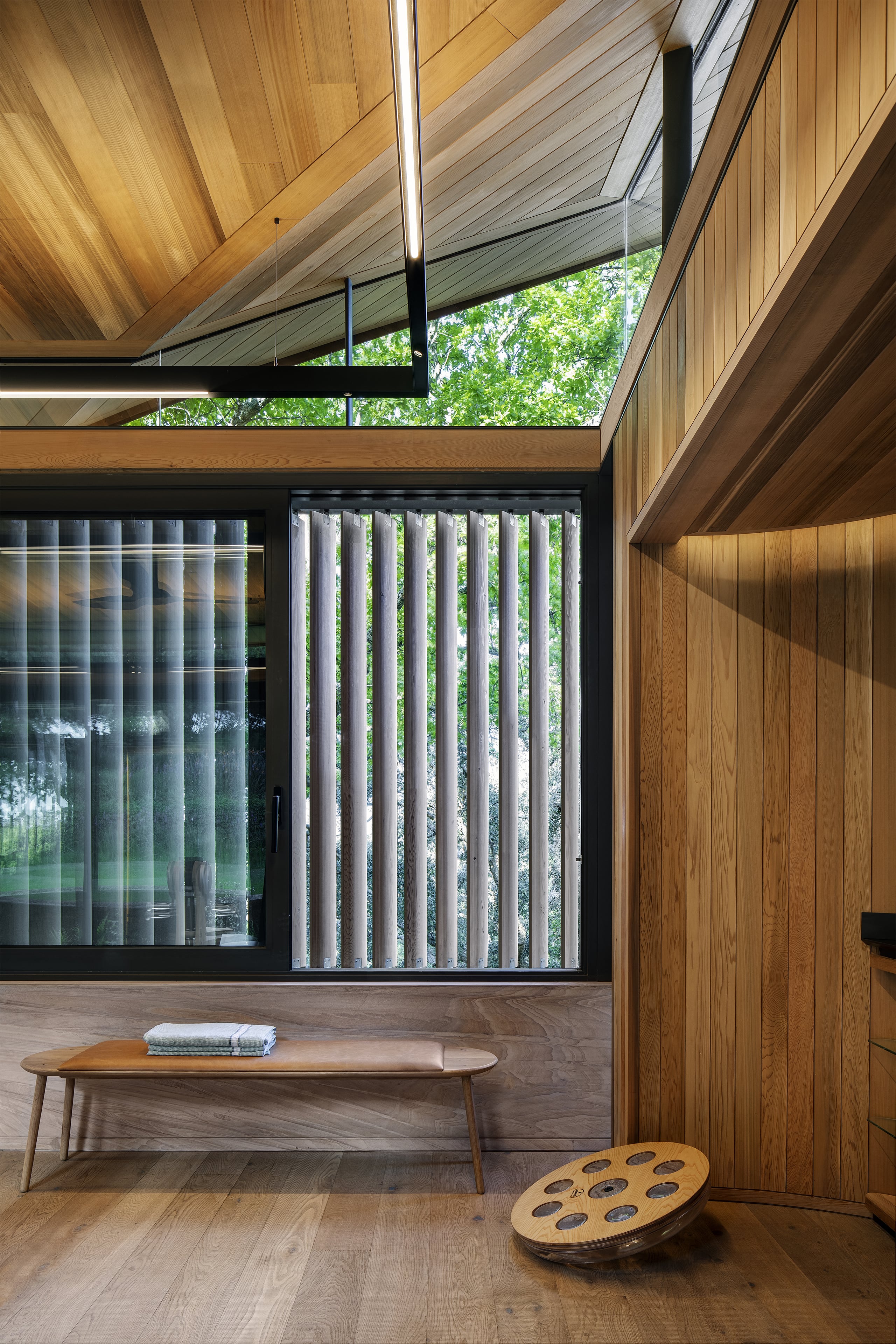
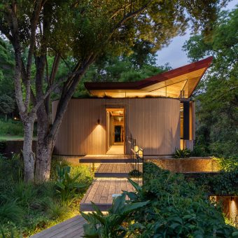
expressed as a folded and floating copper canopy, with two opposite corners lifted upwards to afford views into the adjacent oak trees. The roof is seemingly levitating on frameless glazing, achieved by shaping the steel roof supports to minimal blade-thin slivers.
- The wall planes have been distilled into three distinct elements:
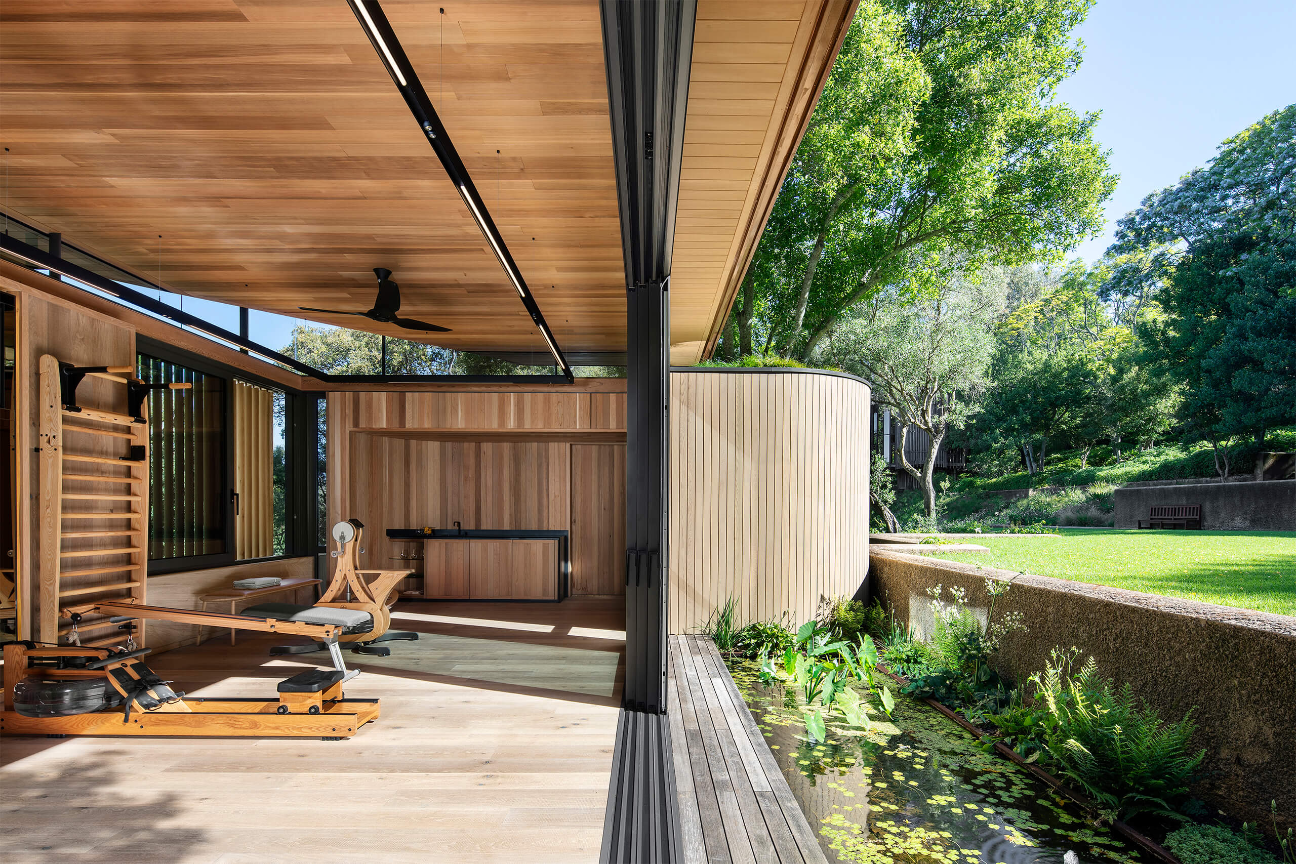
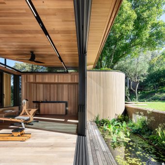
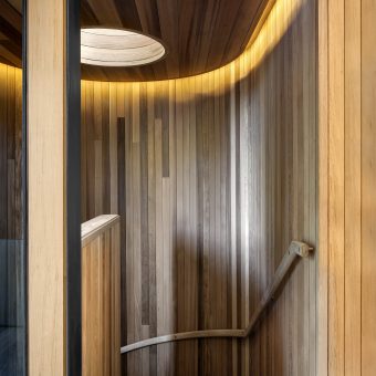
- Firstly, one encounters the curved and timber clad façade that contains the entrance door and houses the staircase to the guest suite in the existing building below. The curved wall elements give a nod to the adjacent tree house geometry.
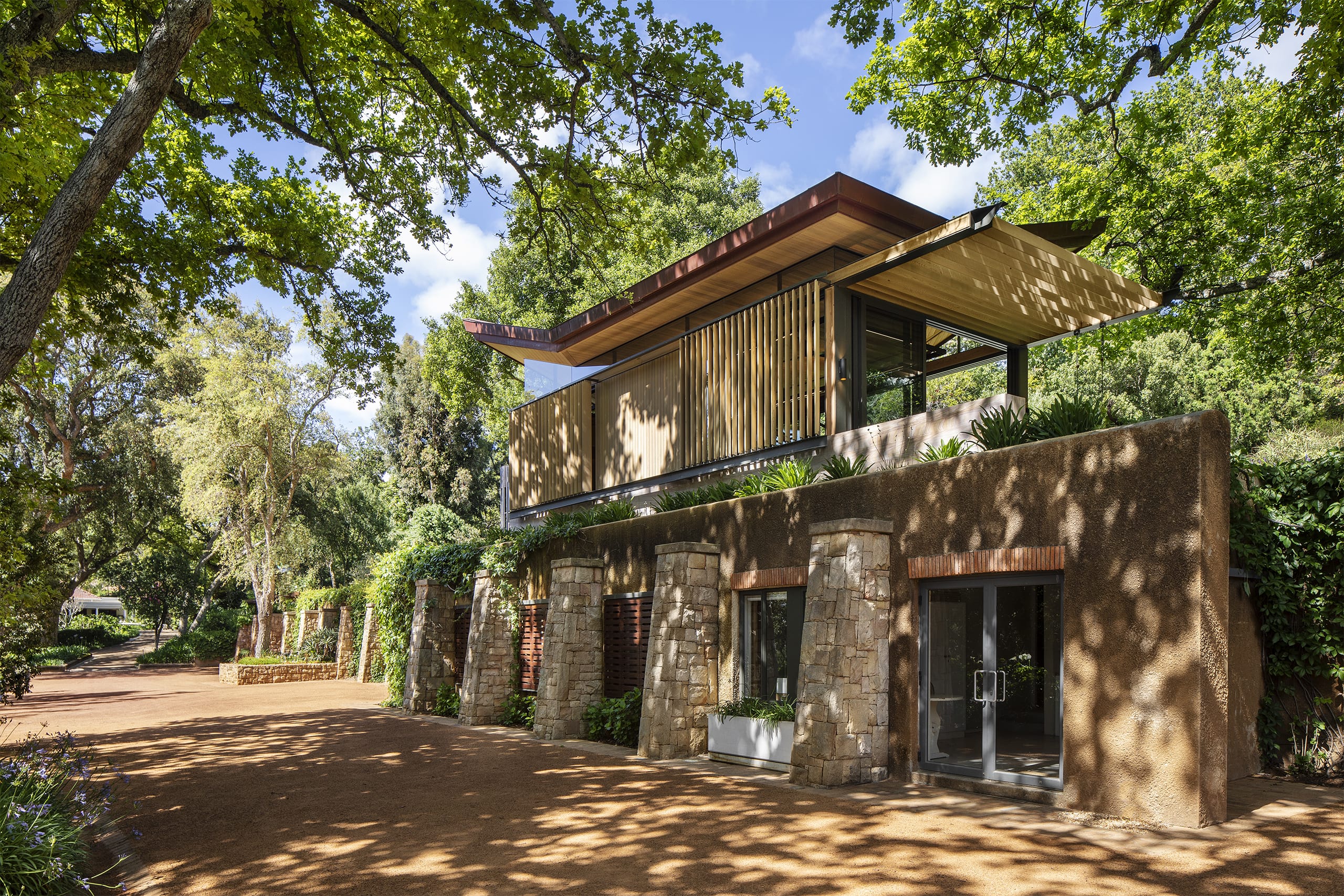
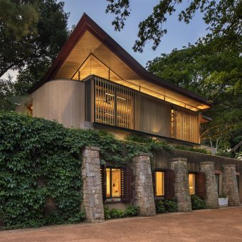
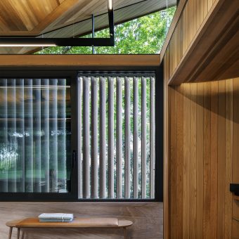
- Secondly, the façade facing the lower gardens and parking “werf” have been treated as a combination of semi-transparent and solid planes: the glazing and aero-foil shaped timber privacy screen elements rest on a sandstone slab wall set back from the existing building edge, to enable plants to creep over the rough and unpainted plaster wall of the guest unit below. The sandstone wall cladding on the new gym is a smoothly honed plane, in the same material but contrasting with the existing building’s roughly hewn sandstone buttresses. The aero-foil timber screens can be adjusted by the inhabitant to suit one’s need for privacy when exercising, or to open up views to the north-eastern gardens and historic cork oak trees situated there.
- Thirdly, the remaining two facades are glazed, with stacking sliding doors opening up completely to the corner of the building, also overlooking a new surrounding fish pond. The doors provide access to a meditation deck on the north-western side, sheltered by an overhead timber pergola. This deck has long views over adjacent vineyards and distant mountains.
- The various facades are structurally linked through a steel H-section column and beam frame, of which two beams extend to form the pergola. Steel H-sections have been filled in with western red cedar elements, all shaped to have softer organic details and edges.
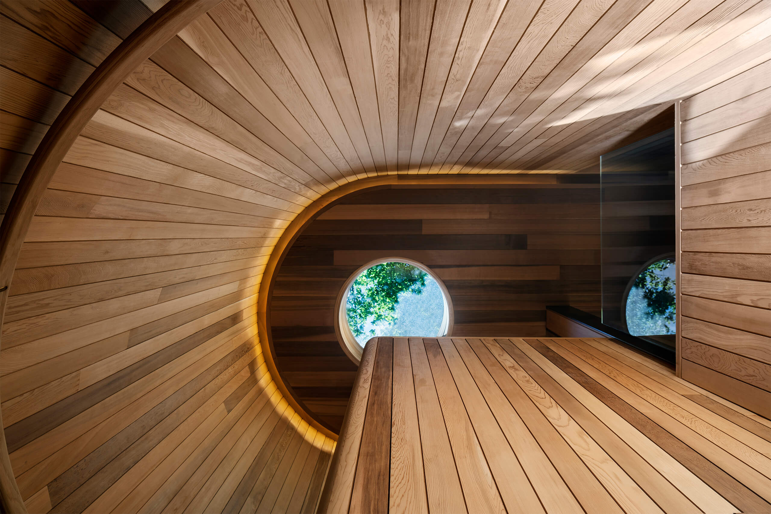
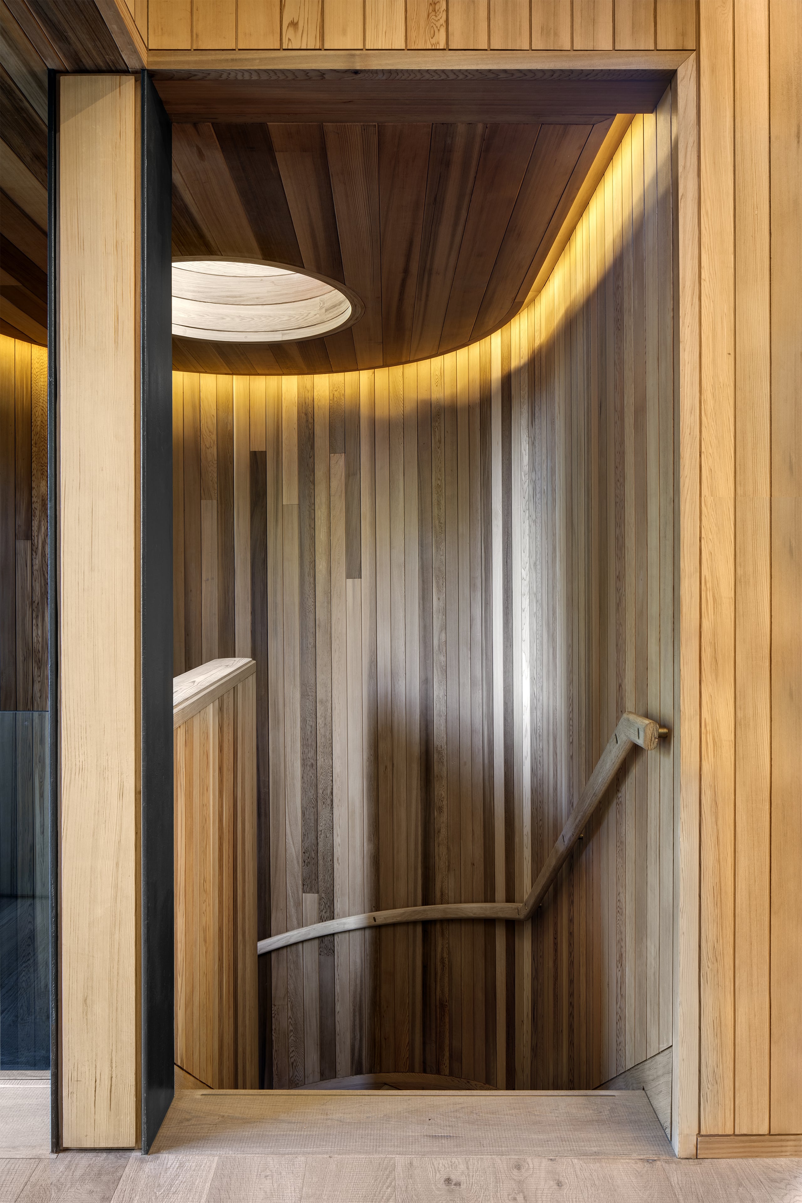
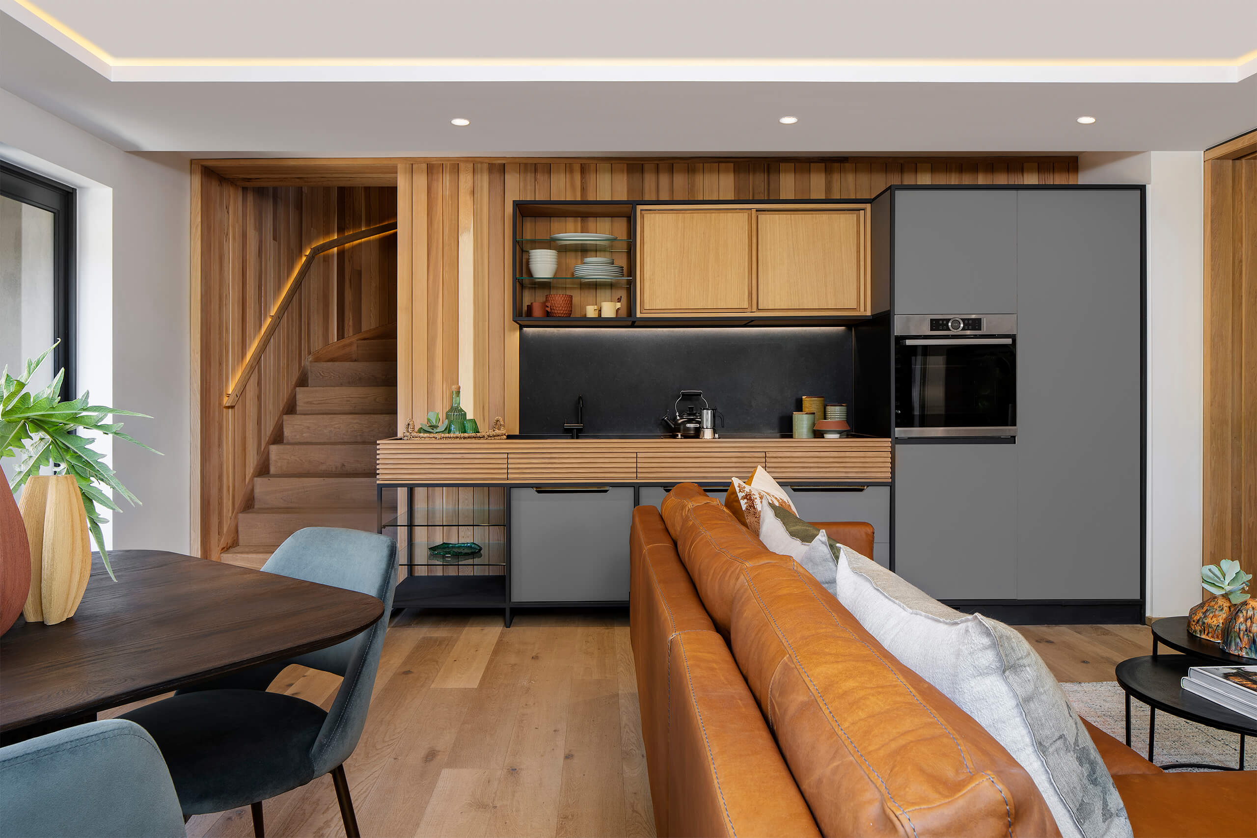
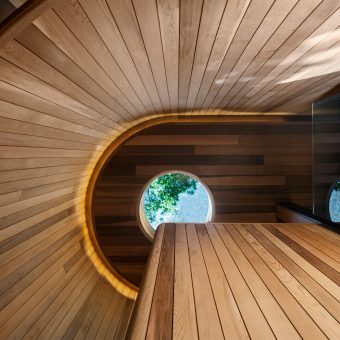
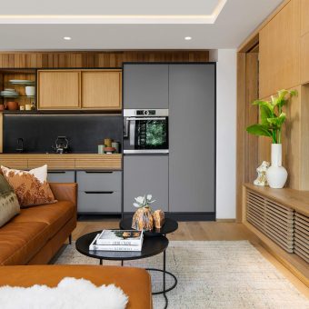
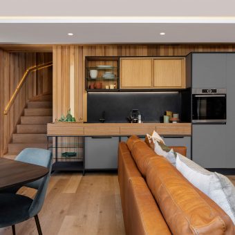
The gym’s interior material selection is a continuation of the building’s materiality, with cedar ceilings, rough sawn timber floors and touches of hand turned brass elements. The same materials are carried through to the renovation of the existing guest unit below, which can be accessed from the gym by means of a cedar clad stairwell lit from above with a round skylight looking up into the tree branches.
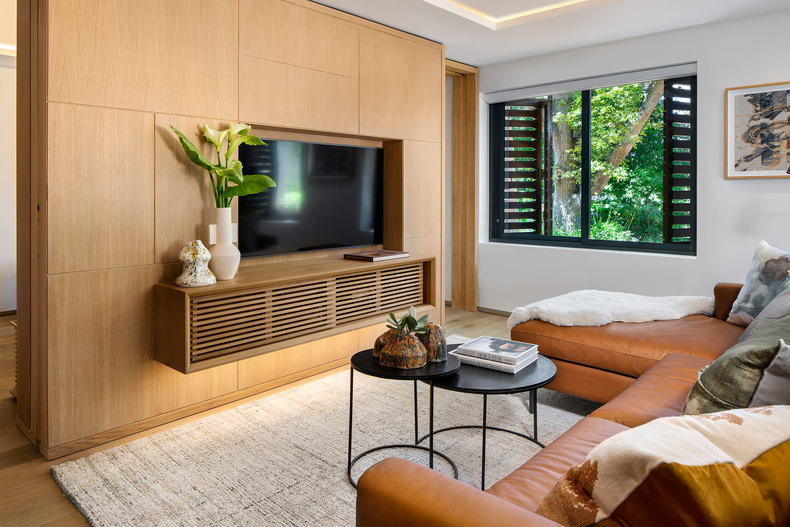
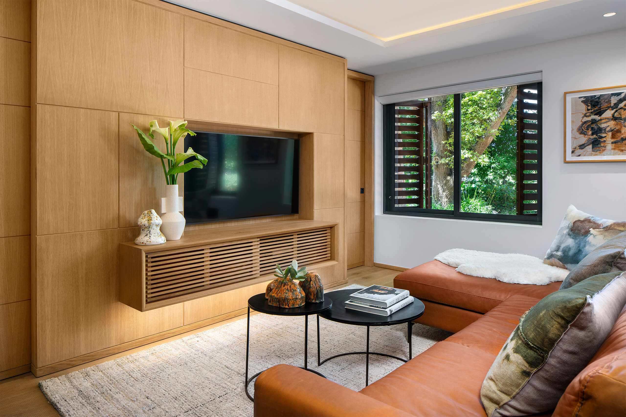
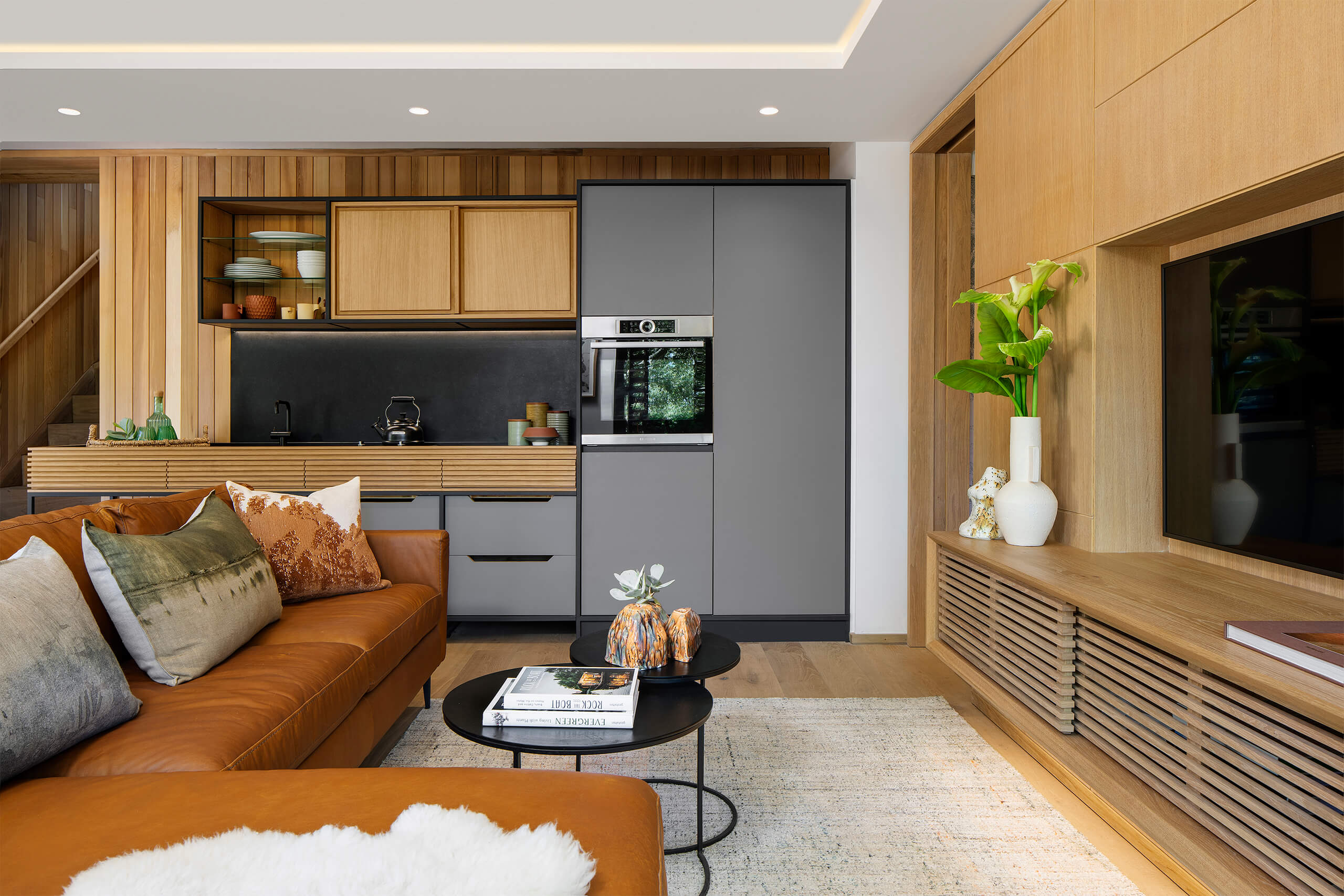
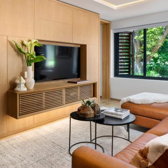
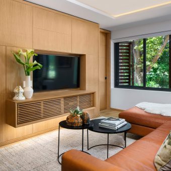
The guest unit consists of a living/dining room with kitchenette, linked to a bedroom suite with privacy pocket-doors on both sides of a floating central tv-unit and headboard wall.
The kitchen and all other cabinetwork were custom designed by the architects.

